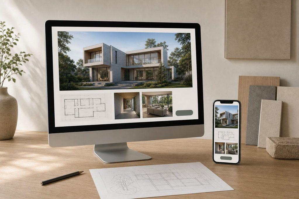
The most photographed architecture website in a comparison set is often the weakest business-development tool in it. A site built to impress a design jury can still fail the one test that matters commercially: whether a stranger with a project can find proof of relevant experience and a way to start a conversation.
That gap is not visible in a screenshot. It only shows up when someone tries to answer a specific question with the site open in front of them: could this project be handed to this firm, and how would that conversation begin. Evaluators comparing options for a client, an employer, or a partnership decision need criteria that survive that test, not aesthetic reactions.
A Strong Architecture Website Proves Fit Before It Displays Taste
Visual quality and business function are not the same claim, and treating them as one is the most common error in a portfolio review. A site can hold striking renders, confident typography, and a distinctive layout, and still leave a visitor unable to tell whether the firm has done anything like their project before, or how to reach anyone if they have.
The image does the work of a gallery. It does not do the work of a pitch.
Splitting the evaluation into separate, non-overlapping dimensions prevents that confusion. Four checks cover the ground without repeating each other:
- Project proof: does the portfolio demonstrate relevant, comparable work.
- Findability and usability: can a visitor locate that proof and move through the site without friction.
- Studio credibility: does the practice’s description and team information support the work shown.
- Inquiry readiness: is there a clear, low-effort way to make contact.
Every later item in this comparison falls under one of those four, and none of them substitute for another. A site can pass on project proof and fail entirely on inquiry readiness, and that failure is fatal regardless of how strong the images are.
The stakes for getting this right are not theoretical. A 2024 AIA Firm Survey found that roughly 73% of small and mid-sized firms report potential clients had already reviewed the firm’s website before the first phone call. That means the site is not marketing collateral sitting alongside the real sales conversation.
For most inquiries, it is the first and sometimes the only chance to establish fit before a human enters the process.
Evaluating architecture firm website design as a business-development asset, rather than as a gallery of finished work, follows directly from that number: if the client has already decided whether to call before anyone from the firm speaks to them, the site has to carry that decision on its own.
Project Pages Carry More Decision-Making Weight Than the Portfolio Gallery
A portfolio gallery earns a click. A project page earns a decision. The distinction matters because most site reviews still treat the gallery grid as the destination, when it should function as an index pointing toward the pages that actually carry evidence: scope, role, drawings, and outcome.
A visitor who never leaves the grid has seen images, not proof.
A Project Case Study Supplies Facts Before Mood
The gallery view sets expectations. The project page has to deliver on them with facts a prospective client can actually use to judge fit. Each featured project should be checked against the following, item by item, marked present or absent rather than judged on impression:
- Its own page. The project is not a caption inside a scrolling gallery; it has a dedicated, addressable page.
- A project description. A short narrative names the client type, the design problem, and the response, not just a location tag.
- Project facts. Site conditions, square footage, budget range, or scope are present where the firm can disclose them.
- Finished images. Completed work is shown, not renders alone, unless the project is explicitly unbuilt.
- Drawings, renders, and plans. Technical material sits beside the photography rather than being omitted entirely.
- Authorship and role credit. It is clear whether the firm led design, executed under another architect, or collaborated, and who else was involved.
- A problem-response-outcome narrative. The page reads as an account of a decision process, not an unlabelled sequence of photographs.
A page missing more than one or two of these is not a style choice. It is a project the visitor cannot actually evaluate.
A Portfolio Gallery Earns Attention Through Curation
The gallery’s job changes once the project pages are doing the proof work: it becomes a filter, not a showroom. A 2026 architecture-portfolio guide recommends limiting the site to three to six strong projects, each with its own page, on the reasoning that reviewers are likely to read the website alongside a PDF or a similar document rather than browse a long, undifferentiated list.
That number is guidance from one source, not a hard limit, but the underlying logic holds regardless of the count chosen: a smaller set of fully documented projects outperforms a large set of thinly captioned ones, because the evaluator is judging depth of proof, not volume of output.
Consistency across templates matters here too. If every project page uses a different layout for facts and credit, the visitor has to relearn the page each time, which adds friction the firm did not intend to create.
Navigation Must Reveal the Right Project Without Making Visitors Decode the Studio
Navigation structure and project content are two different failure points, and a site can get one right while getting the other wrong. A visually rich project page buried three unlabeled clicks deep is still unreachable, and unreachable proof functions the same as absent proof.
The navigation check is separate from the content check precisely because it can fail on its own.
Four observable checks cover the navigation layer without duplicating the content review already applied to individual projects:
| What To Verify | Why Its Absence Creates Friction | What a Pass Looks Like |
|---|---|---|
| Top-level menu count | A crowded menu forces the visitor to guess which label leads to relevant work | Five items or fewer, used as a benchmark rather than a strict rule |
| Project-type filtering | Without it, a visitor sorts through irrelevant projects to find a comparable one | A filter or clearly labeled grouping by typology, scale, or sector |
| Location or service routes | A visitor cannot confirm the firm works in their area or offers their needed service | Distinct, findable paths for service type or geography where relevant |
| Contact access from any page | A visitor who is convinced has nowhere obvious to act on it | A visible contact link present in the main menu, not buried in a footer alone |
The five-item menu guidance functions as a benchmark for judging clutter, not as an absolute ceiling; a sixth clearly labeled item is not automatically a failure. What matters is whether the structure gets a visitor from the homepage to a comparable project, and from that project to a way to act, without forcing them to guess at what a label means.
Heavy Visual Assets Weaken the Portfolio When They Hide the Evidence or Delay It
Drawings, renders, and plans are the evidence a design-literate client actually wants, but only if they can be read once loaded. A dense floor plan reduced to a thumbnail, with no way to enlarge or zoom, communicates less than a well-labeled sketch.
Mobile responsiveness belongs to the same category of concern as legibility. It is a component of user experience design, not a finishing touch applied after the desktop layout is set, because a growing share of first visits happen on a phone regardless of how the site was originally designed to be viewed.
Three checks apply directly to visual assets and their behavior across devices:
- Legibility and labeling: drawings and plans are large enough to read, captioned, and placed near the narrative they support rather than dropped into an unlabeled gallery.
- Responsive behavior: technical images remain useful at narrow widths, either through adaptive sizing or a tap-to-expand function, rather than shrinking past the point of being readable.
- Load and optimization review: image files are checked for size and compression rather than assumed to be fine because they display correctly on a fast connection during a desktop review.
A project page that hides its own drawings behind poor mobile handling has, functionally, deleted them for a meaningful share of visitors.
Studio and Services Pages Convert Capability Into Credible Project Fit
The studio page and the services page carry a different kind of proof than the project pages do: not what was built, but what the firm is willing and able to take on. An evaluator should be able to answer four questions from these pages alone:
- What does the practice actually do.
- Which project types and scales does it accept.
- How does its stated approach relate to the work already shown in the portfolio.
- Is team and collaborator credit stated plainly, rather than implying sole authorship over work that was shared or led by another firm.
That last question deserves direct scrutiny. A studio page describing broad design authority, next to project pages that credit a collaborating architect of record in smaller print, is a credibility mismatch a careful evaluator will notice.
Client testimonials belong here only when they clear a specific bar: a testimonial should name a real outcome or describe a working relationship, not offer generic praise that could apply to any firm. A testimonial that only says the process was pleasant does not support a commissioning decision.
One that describes how the firm handled a difficult site constraint or a budget change does.
The studio page succeeds when its claims can be checked against the project pages sitting one click away, and fails when it reads like a separate marketing document disconnected from the evidence beside it.
A Visible Contact Path Matters More Than a Clever Conversion Gesture
Several failures at the inquiry stage are easy to verify and easy to miss during a casual browse. A call-to-action button that is missing, or present but vague (“Learn More” instead of something closer to “Discuss a Project”), gives a convinced visitor nowhere obvious to go.
A contact form buried two or three clicks from any project page forces someone to backtrack at the exact moment their interest is highest.
Pages that simply end, with no invitation to reach out about a similar project, waste the credibility the previous sections built.
Each of the following should be checked directly, not assumed:
- does a call-to-action appear on project pages and not only on a standalone contact page;
- does the services page offer a next step rather than ending on a description;
- does the mobile layout preserve the same button and form access as desktop.
None of this supports a claim about a higher conversion rate; there is no benchmark here to promise. What can be verified is simpler and more binding: whether a genuinely interested visitor can act on that interest without hunting for the mechanism, a test a decorative button dressed up as a design element will not pass.
Platform Choice Is Secondary Until the Site Can Be Maintained Without Breaking Its Proof
None of the checks above depend on which platform built the site. What they depend on is whether the site can absorb ordinary maintenance without losing the proof it currently holds.
A workable sequence looks like this:
- publish a new project page,
- update its images and facts as the work progresses,
- keep the same template so the new page matches the others,
- confirm responsive behavior still holds on the updated page, and
- verify the contact route is still reachable from it.
Squarespace, Wix, WordPress, Behance, Adobe Portfolio, Weebly, and Format each handle that sequence differently, and none of them guarantees it automatically.
The relevant question is not which platform is best in general, but whether the current setup lets the firm:
- add a project without breaking a template,
- losing mobile behavior,
- or orphaning the contact path.
Hosting stability, domain ownership, and basic search engine optimization settings belong in the same maintenance check, not in a separate ranking of platforms.
The Winning Website Is the One Whose Evidence Survives a Single Project-Page Audit
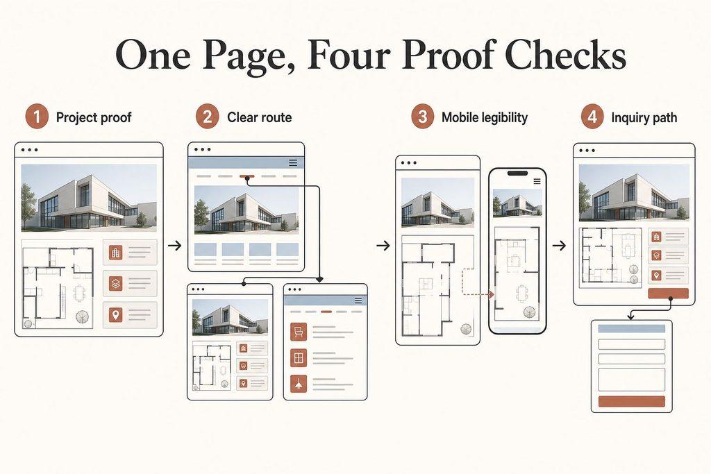
A comparison across several firms’ sites does not need a long session to resolve. Pick one representative project page on each site and run it through the same sequence:
- verify the project case study evidence is complete,
- trace the navigation from the homepage into that page and back out to the services section,
- test the page at a narrow screen width to confirm drawings and images still hold up, and
- follow the call-to-action button through to the contact form to confirm it works.
Whatever site survives that single pass with the fewest gaps has passed the only test that maps onto an actual client decision.
The rule that decides between two otherwise similar sites: choose the one whose representative project page lets a prospective client verify relevant work, understand the studio’s role, and start an inquiry without searching for any of those facts.