A landscaping company spends a season’s marketing budget on photography, hires a designer to build a homepage around the best shots, and watches the bounce rate sit above 70 percent for six months. The homepage is not the problem. It looks like a portfolio piece in its own right, all wide hero images and drone shots of finished patios. The problem is what happens after the scroll: the visitor lands, admires the imagery, and then has no path forward that matches what brought them there in the first place.
That gap between visual polish and functional direction is common because the two are built by different instincts. A designer optimizes for how a page looks in isolation. A homeowner arrives mid-decision, usually comparing three or four companies in one sitting, and needs the page to answer a narrower question fast: can this company do the specific job I need, near me, and how do I ask them to look at my property.
Define the Consultation Path Before Styling the Site
The failure above is a specification failure before it is a design failure. Nobody wrote down what the visitor was supposed to do at each screen, so the build defaulted to displaying the company’s best work in the order it looked best, not the order a homeowner needed it.
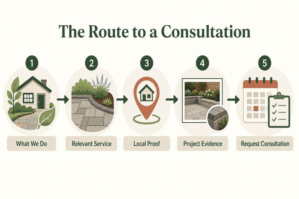
A workable landscaping site has one non-negotiable path, and every page decision should be tested against it: immediate value proposition, then a relevant service, then local proof, then project evidence, then a visible request for a site consultation. Skip a link in that chain and the visitor either bounces or wanders into a generic gallery with no reason to keep going.
If the homepage cannot say, within the first screen, what the company does and where, everything below it is competing against a decision the visitor has already started making elsewhere.
Four failure modes recur enough to treat as specification problems rather than execution mistakes:
- Poor navigation that buries services under a single “Services” dropdown with no indication of what is inside
- Slow load times driven by unoptimized hero video or full-resolution gallery images
- Unclear value proposition that describes the company (“family owned since…”) before it describes what the company solves
- High bounce risk created by sending every visitor to the same broad gallery regardless of what they searched for
None of these are style choices. They are gaps in the requirements document, and they show up as the same complaint from every homeowner who leaves without contacting anyone: the site was nice, but it did not tell them what to do.
Build the Homepage Around Homeowner Decisions
The homepage carries two jobs at once, and they get built at different points in the scroll. The first job happens above the fold, before the visitor has invested any attention. The second happens as they scroll down, deciding whether to keep reading or leave.
What the First Screen Has to Prove
Above the fold needs to answer three questions without requiring a click: what does this company do, where do they do it, and what happens if someone wants to talk to a person. A landscaping website example guide focused on lawn care sites recommends visible testimonials, reviews, and contact information paired with mobile optimization and a prominent call to action, and that combination is doing real work: it collapses trust-building and next-step clarity into the same glance.
What the Scroll Has to Resolve
Below the fold, the homepage has to move a still-undecided visitor toward a specific service page or the consultation form, not just present more brand content. A homeowner checklist for that stretch of the page should cover:
- Service cues above generic copy: name the actual services (drainage correction, patio installation, seasonal maintenance) instead of a single “landscaping services” link, removing the friction of guessing whether the company does the specific job
- A primary call to action repeated, not just present once: request a consultation should appear near the top and again after the proof sections, so the decision point is never more than one scroll away
- A secondary action for the not-yet-ready visitor: a phone number or a “view our work” link gives an exit that is not a full bounce
- Testimonials or reviews visible without a click: third-party language removes the friction of taking the company’s own claims at face value
- Contact details in the header or footer, not buried: a visitor checking service area or hours should not need to open a separate page
- Real project imagery, not stock photography: homeowners comparing companies can usually tell the difference, and stock imagery reads as evidence of nothing
- Mobile layout tested as its own build, not a shrunken desktop version: most of this traffic arrives on a phone mid-search
- A consultation form reachable in one click from every major section: the form is the destination; nothing on the page should be a dead end that requires backtracking to reach it
Each item on that list removes a specific hesitation. A homepage that satisfies all of them stops functioning as a brochure and starts functioning as a routing system.
Match the Portfolio to the Service Being Sold
A single portfolio page trying to represent lawn care, hardscape installation, turf conversion, and pest treatment in one undifferentiated grid asks the homeowner to do sorting work the site should be doing for them. Each of those service categories earns trust through a different kind of evidence.
A 2026 landscaping website example roundup makes this split explicit, distinguishing lawn-care-focused sites from outdoor-living examples and from broader combination sites that pair landscaping with pest control and tree care. These four categories are illustrative groupings, not a claim about how competitors in any particular region build their sites. They exist to show what differentiated proof looks like when the service itself changes what a homeowner needs to see before trusting it with their property.
| Service category | Homepage proof focus | Strongest supporting evidence | Consultation cue |
|---|---|---|---|
| Lawn care | Consistency across a full season | Before-and-after turf photos over several months | “Get a lawn assessment” near seasonal photos |
| Outdoor living | Design range and material quality | Complete-space project photos with material detail | “Discuss your outdoor space” beside a finished patio |
| Turf installation | Technical correctness and durability | Installation process photos and drainage detail | “Request a turf estimate” after the process section |
| Pest-related work | Speed of response and treatment scope | Service-area coverage and licensing or certification proof | “Schedule an inspection” near credential proof |
The pattern across all four rows is the same: the proof that convinces a homeowner changes with the service, but the consultation cue never disappears. It just changes its wording to match what the visitor was just convinced of.
Prove Capability With Projects, Photographs, and Testimonials
A gallery of finished projects only builds trust if it answers questions the homeowner is actually holding, and most galleries do not. A grid of thumbnails with no context proves that work happened somewhere, not that it happened somewhere comparable to the visitor’s own property, under conditions the visitor cares about.
Distinct project pages solve this by giving each finished job the space to answer what a thumbnail cannot: what the site looked like before, what constraints the crew worked around, and what the finished result actually involved. A project page that establishes local proof, meaning it names the town or neighborhood and the kind of property, does more conversion work than a technically superior photo with no location context at all.
What a Project Page Has to Show
A strong project page tends to earn its place in three passes, each answering something the previous one could not:
- A complete-space photograph rather than a flattering close-up angle, so the homeowner can judge scale and layout at a glance
- Detail images placed alongside it, such as a close shot of stonework joints or drainage grading, answering the “will this actually last” question that a wide shot cannot
- Before-and-after framing, where the site had a real starting condition worth showing, which does more to establish credibility than any amount of finished-result photography alone
Where Testimonials Actually Work
A testimonial sitting on a standalone “reviews” page gets read by almost nobody. Placed next to the specific service or project it references, the same words do the job they were meant to do. They confirm, at the exact moment a homeowner is deciding whether this crew can be trusted with a specific job, that someone else already trusted them with something similar.
A landscaping website example guide makes the same point about visible testimonials paired with contact information: proximity to the decision point is what makes trust content function, not its existence somewhere on the site.
Before any visitor reaches the consultation form, each of these assets needs to have already answered a question on its own: is this the kind of work needed, does it hold up in a real neighborhood, and did someone in a similar situation end up satisfied. A form that appears before those questions are settled just adds friction to an unfinished decision.
Organize the Menu Into Services, Proof, and Contact Paths
The navigation menu is the site’s table of contents, and a homeowner scanning it in three seconds should be able to tell where the answer to their question lives. A menu built around internal department names (“Our Process,” “Philosophy”) instead of homeowner questions fails that test even when every page behind it is well built.
A working menu inventory covers a fixed set of destinations, each earning its place because it resolves a specific question rather than adding general information:
- A focused homepage that routes rather than explains everything itself
- Distinct service pages, one per major offering, not a single combined page
- A project gallery organized by service category, feeding into individual project pages
- An about or credibility page covering licensing, insurance, and years of operation
- Testimonial or review proof, either standalone or distributed near relevant services
- Service-area support, showing where the company actually works
- A contact page with phone, address, and hours stated plainly
- A consultation form, reachable from the main navigation on every page, not buried in the footer
Where a company serves both residential and commercial clients, that content needs separate paths once the two audiences want different proof: a commercial property manager cares about contract terms and crew scheduling in ways a homeowner does not, and folding both into one page forces a compromise that serves neither well. Every label on the menu should lead to a page that moves the visitor one decision closer to the form, not to a page that only restates what the label already said.
Limit Service Areas to Supportable Local Proof
A location page for every city within driving distance looks thorough and reads as empty. If a page only exists to insert a city name into otherwise identical text, it signals the opposite of local expertise, and homeowners notice the pattern quickly on a phone screen.
Location pages earn their place under one condition: they carry proof specific to that place, not just its name.
A location page is a proof container, not a keyword placeholder, and it should be built or withheld on that basis alone.
That means a completed project from that town, a review naming the neighborhood, or a service-area statement backed by accurate business information.
A company genuinely working across a metro area, say Houston or Austin, can support pages for each if it has project or review evidence tied to that specific market. A company without that evidence for San Antonio or Charlotte should not build the page yet, because a location page with no local proof behind it does less for trust than no page at all.
The same logic holds wherever proof is thin:
- Phoenix,
- Colorado,
- Los Angeles, and
- broader state-level pages for Texas or California
only justify their existence with the same ingredients:
- reviews,
- project context, and
- accurate contact and licensing information tied to that place.
Protect the Experience With Performance and Measurement Requirements
None of the structural decisions above matter if the site loads slowly on a phone or if nobody is measuring whether the consultation path actually works. Performance and measurement belong in the same specification as the layout, not as an afterthought handed to whoever builds the site last.
A team implementing this in WordPress, following the structure covered in a guide on landscaping web design, should treat the items below as acceptance conditions, not preferences.
| Build requirement | UX risk if skipped | Measurement signal | Acceptance condition |
|---|---|---|---|
| Mobile-first performance tuning | Slow load drives immediate bounce | Bounce rate, time on site | Loads fully within a few seconds on mobile |
| Compressed, sized project images | Gallery pages stall on mobile data | Bounce rate on gallery pages | Images load without visible delay |
| Crawlable service and location pages | Pages never surface for relevant searches | Click-through rate from search | Pages indexed and appearing for target terms |
| Tracked consultation form | No visibility into what converts | Form submission rate, conversion rate | Every submission logged and attributed to its source page |
Google Analytics should confirm where consultation requests originate, and a tool like Hotjar can show where visitors stall or abandon the form, both feeding back into which sections above are actually earning their space on the page.
Approve the First Consultation Route Today
Everything above resolves into one decision that has to be made before a designer or developer starts building anything else: which single consultation path is the site’s real conversion route, and is every piece of proof actually feeding it.
Confirm these, in order of what breaks first if skipped:
- The primary site consultation request exists as one clear, repeated action, not several competing forms or a buried contact page
- That request is visible from the homepage without scrolling past every proof section first
- The service and project proof feeding it matches what the target homeowner actually needs to see for that service
- Location claims match places the company can actually support with real proof, not aspirational coverage
- Form submissions and on-site behavior are being measured from day one, not added after the first traffic arrives
Approve that single consultation route before any design work begins, and treat every other page decision as something that either strengthens it or gets cut.